


Last Updated on November 29, 2025 by sandeeppote

Often you see examples for creating a new Sitecore SXA component is suggested to be cloned from the Promo component which helps developers to quick start the development.
But its always good to know the process and supporting items that are created to support he component.
In this blog post I will walk through the steps required to create a SXA component using Scriban from scratch. This post is not about how to use Scriban, will cover that in another post.
This post assumes the SXA Site is configured with the custom theme. See links to create Tenants/Sites/Themes –
The component contains images and text and should look like this-

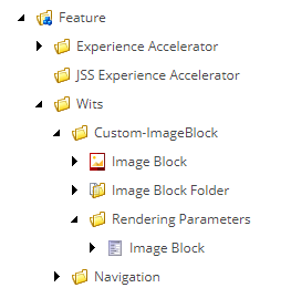
Step 1 – Create Templates –
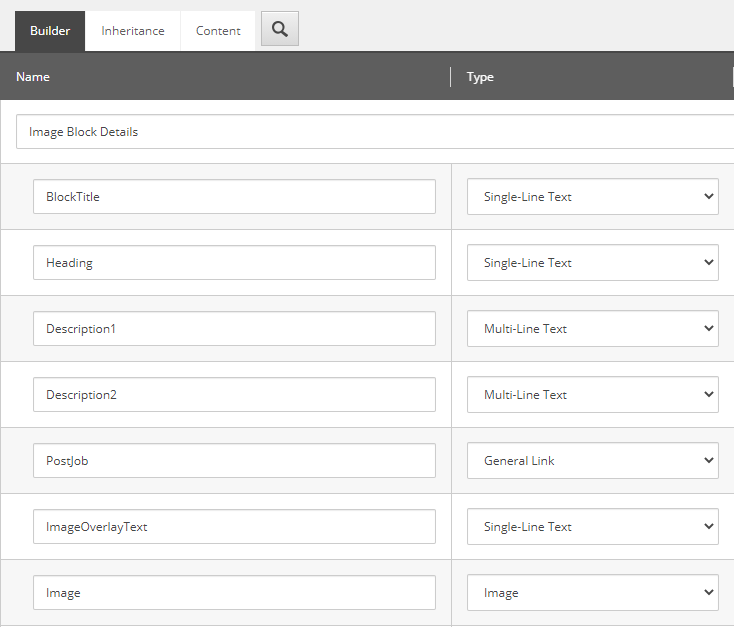
Lets start creating a template first. Lets give it a name ImageBlock
Template Name – Image Block
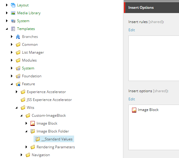
Template Name – Image Block Folder
Set the Image Block as Insert Options so Image Blocks can be created under Image Block Folder
Template Name- Image Block (Rendering Parameter)
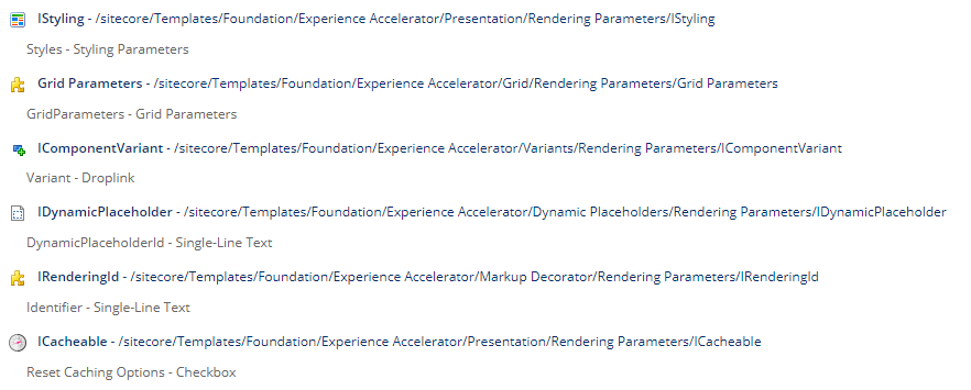
The below inheritance is required to style, cache and attach a rendering variant.
This template should inherit following-
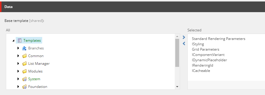
Inherited template paths-
Template structure for Image Block component looks like this-
Step 2 – Create Rendering for Image Block component
Before you could start creating rendering, its good to have content as the rendering will require the Datasource location and the view.
Content–
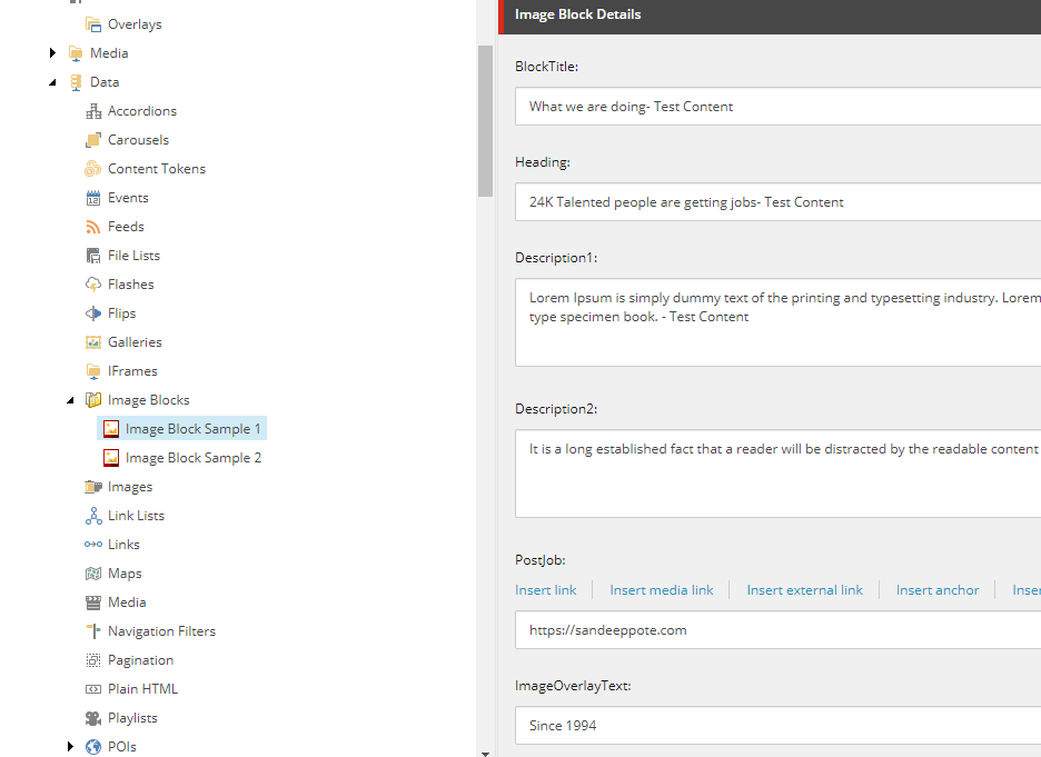
IMPORTANT– Data folders for component can be configured using modules. For this post will create it manually.
Navigate to the Site -Data folder and create a Image Block Folder
Example at this location-
/sitecore/content/Wits Recruitment/Wits/Site Regions/Wits UK Recruitment/Data
I have named it Image Blocks and enter content for the template-
View–
Create a view. Place following markup in cshtml. Place this in your custom folder in Sitecore instance view folder
@using Sitecore.XA.Foundation.RenderingVariants.Extensions
@using Sitecore.XA.Foundation.SitecoreExtensions.Extensions
@using Sitecore.XA.Foundation.Variants.Abstractions.Fields
@model Sitecore.XA.Foundation.Variants.Abstractions.Models.VariantsRenderingModel

@if (Model.DataSourceItem != null || Html.Sxa().IsEdit)
{
    if (Model.DataSourceItem == null)
    {
        @Model.MessageIsEmpty
    }
    else
    {
        foreach (BaseVariantField variantField in Model.VariantFields)
        {
            @Html.RenderingVariants().RenderVariant(variantField, Model.Item, Model.RenderingWebEditingParams, Model)
        }
    }
}
Rendering–
Create controller rendering for Image Block Controller
Controller– Sitecore.XA.Foundation.RenderingVariants.Controllers.VariantsController, Sitecore.XA.Foundation.RenderingVariants
Controller Action- Index
Parameter Templates – Select the Rendering Parameter template created in previous step.
Example – /sitecore/templates/Feature/Wits/PageContent/Rendering Parameters/Image Block
Datasource Location – Query to the Site data location. You may also have to consider same for shared sites
Sample- query:$site/[@@name=’Data’]/[@@templatename=’Image Block Folder’] | query:$sharedSites/[@@name=’Data’]/ [@@templatename=’Image Block Folder’]
Datasource Template– Location of the template (Image Block)
Example- /sitecore/templates/Feature/Wits/PageContent/Image Block
Rendering view path– provide the path of your custom view
Example- ~/Views/Wits/ImageBlock.cshtml
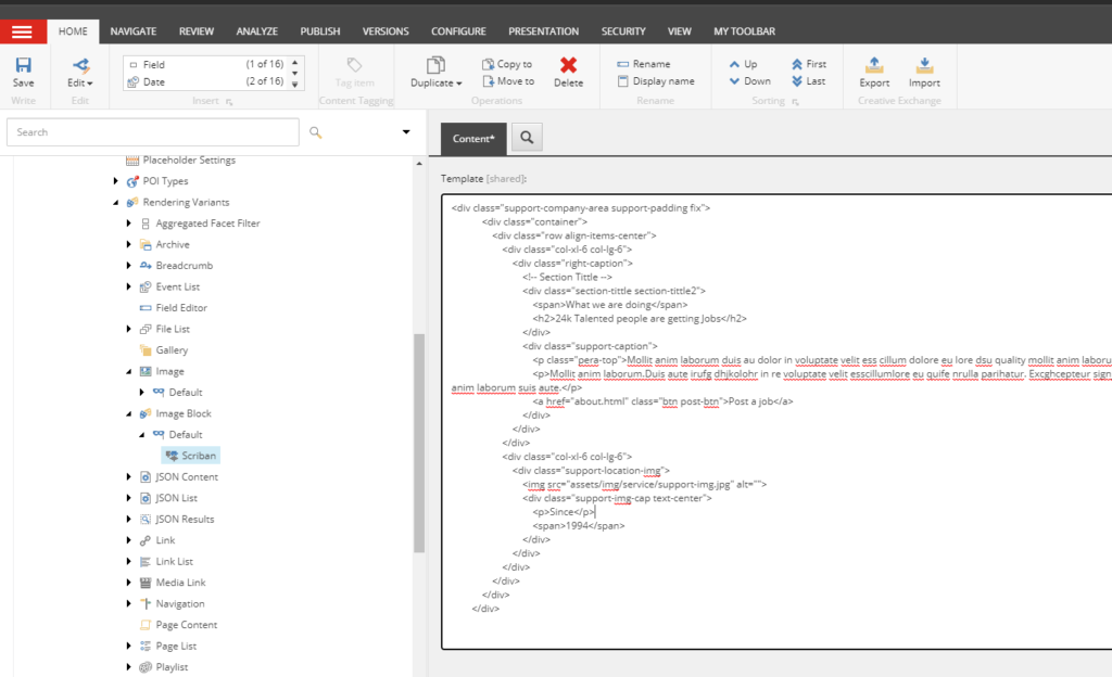
Step 3 – Create Rendering Variant
Create a rendering variant i.e. items from templates-
/sitecore/templates/Foundation/Experience Accelerator/Rendering Variants/Variants
/sitecore/templates/Foundation/Experience Accelerator/Rendering Variants/Variant Definition
/sitecore/templates/Foundation/Experience Accelerator/Scriban/Scriban
Paste the markup to render
Step 4 – Add rendering to Page
Add rendering to the page. Ideally this can be done by creating a Branch and create a module which should allow to drag and drop the SXA component to the page using experience editor.
Select Home page and select option Presentation ==> Details
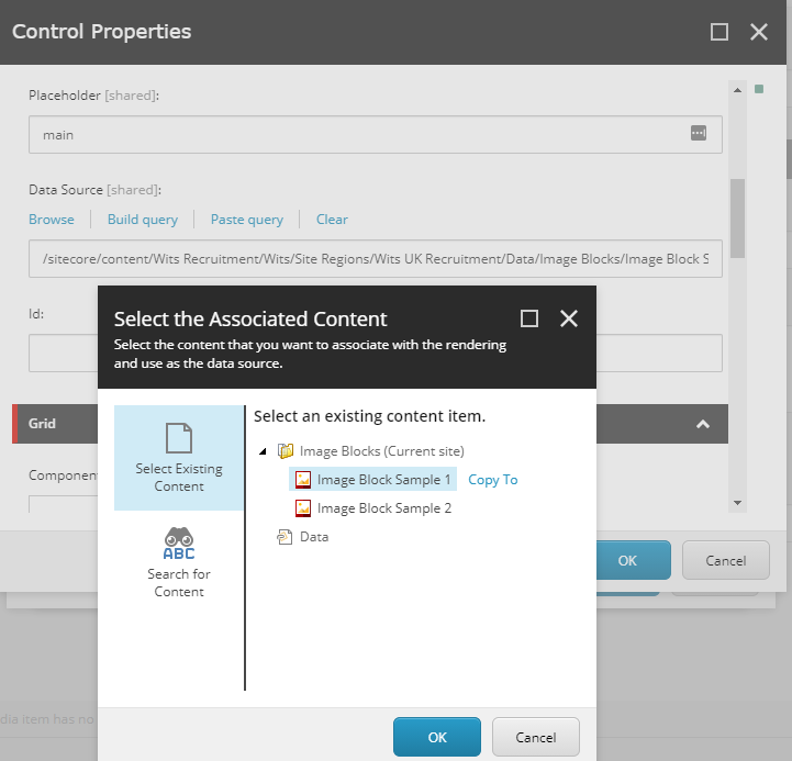
Add the rendering “Image Block” in the placeholder “main”
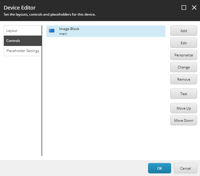
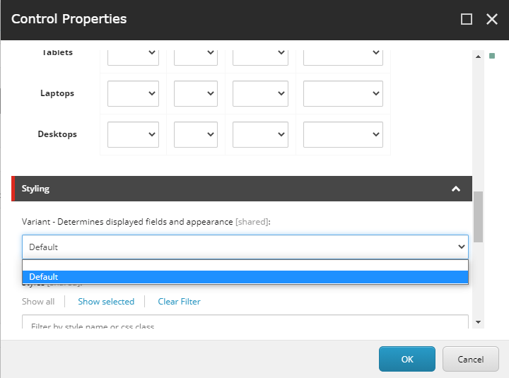
Edit the control and select the Variant “Default” in Styling section.
Remember we created a Rendering Variant “Image Block” in step Step 3 and the name of the variant was “Default”. This variant is listed in dropdown for selection. Also select the datasource
Select rendering variant-
Select the datasource-
Save and Publish and should be able to see the newly created component in Home page

Step 5- Update rendering variant to display content from Image Block item
In step-3 we added a static markup in rendering variant.
Use the following scriban changes to get the content from selected datasource. See BlockTitle, Heading and Description1 and Description2 to pull the content from item-
Example- {{sc_raw i_datasource ‘Description2’ }}
<div class="support-company-area support-padding fix">
            <div class="container">
                <div class="row align-items-center">
                    <div class="col-xl-6 col-lg-6">
                        <div class="right-caption">
                            <!-- Section Tittle -->
                            <div class="section-tittle section-tittle2">
                                <span>{{sc_raw i_datasource 'BlockTitle' }} </span>
                                <h2>{{sc_raw i_datasource 'Heading' }}</h2>
                            </div>
                            <div class="support-caption">
                                <p class="pera-top">{{sc_raw i_datasource 'Description1' }}</p>
                                <p>{{sc_raw i_datasource 'Description2' }}</p>
                                <a href="about.html" class="btn post-btn">Post a job</a>
                            </div>
                        </div>
                    </div>
                    <div class="col-xl-6 col-lg-6">
                        <div class="support-location-img">
                            <img src="assets/img/service/support-img.jpg" alt="">
                            <div class="support-img-cap text-center">
                                <p>Since</p>
                                <span>1994</span>
                            </div>
                        </div>
                    </div>
                </div>
            </div>
        </div>
Finally we have component been rendered and content pulled from item-

Hope this helps.